Villa Bianco
Updated: 6 days ago
Overview
Villa Bianco is a premium residential building in Brasília, Brazil, designed for people seeking quality, comfort, and a distinctive living experience. The project called for a visual identity that could communicate architectural refinement while remaining warm, approachable, and connected to the feeling of home.
The name became the starting point for the visual concept. Bianco, meaning “white” in Italian, suggested the idea of a blank canvas — a space for new beginnings, new stories, and the next chapter of life.
The goal was to translate this concept into a cohesive visual identity that expressed the development’s premium character without relying on conventional luxury aesthetics. Through typography, colour, and carefully considered graphic elements, the identity brings together sophistication, simplicity, and a welcoming sense of belonging.
Role: Graphic Designer — Visual Identity Development
Collaboration: Worked in partnership with the brand strategist, who led brand positioning and verbal identity.
Scope: Visual Identity · Logo Design · Typography · Colour System · Graphic Elements · Social Media Applications · Brand Applications
Tools: Figma · Adobe Illustrator · Adobe Photoshop · Adobe InDesign

The Challenge
For Villa Bianco, the challenge was to establish a distinctive brand presence that reflected the development’s refined character without feeling distant or impersonal.
The identity needed to balance exclusivity with warmth, translating architectural sophistication into a visual language that also conveyed comfort and the idea of home.
Rather than relying on predictable luxury cues or excessive decoration, the direction needed to communicate quality through typography, proportion, colour, and attention to detail.
The resulting system also had to remain flexible across different brand applications, maintaining a consistent visual character while adapting to different formats and communication needs.

The Approach
The project began with an in-person moodboarding session developed collaboratively with the client. The goal was to explore the visual associations, references, and feelings that could shape Villa Bianco's identity.
Through a hands-on cut-and-paste exercise, the client selected and assembled visual elements, explaining what each one represented and how it connected to their vision for the brand. This created an opportunity to understand the ideas behind their preferences and establish a shared visual direction before moving into design development.
The resulting moodboard became the foundation for the visual identity, informing decisions around typography, colour, composition, and graphic elements. Working in partnership with the brand strategist, who was responsible for positioning and verbal identity, I translated the agreed direction into the complete visual identity.

From the initial visual exploration to the development of the wordmark and supporting system, I was responsible for the design work independently. The first identity proposal was approved by the client, providing a clear indication that the visual direction successfully reflected the expectations established during the collaborative session.
Developing the Wordmark
The wordmark combines Tenez and Commuter Sans, bringing together classic elegance and contemporary clarity. Tenez introduces a more expressive, sophisticated character, while Commuter Sans provides a clean and modern counterpoint. Together, they create typographic contrast without compromising the coherence of the identity.

A custom treatment of the letter “A” adds a distinctive detail to the wordmark. Its form introduces a subtle sense of movement and references architectural lines, connecting the typography to the built environment without relying on a literal architectural symbol.
This detail gives the wordmark its own visual character while remaining integrated into the overall composition. Rather than depending on a separate decorative mark, the identity uses typography itself as an important vehicle for expression.

Colour System
The colour palette reinforces the concept of Bianco, making the brand name an integral part of the visual language.
Three shades of white form the foundation of the system. Their subtle variations create depth and flexibility while maintaining a light, spacious visual character. White is not simply a background colour; it connects directly to the idea of a blank canvas and the possibility of new beginnings.
A muted golden tone introduces warmth and a discreet sense of luxury while shades of green add contrast and visual depth across different compositions.

The palette was designed around balance and proportion rather than decorative impact. White remains dominant, while the complementary tones can be introduced according to the needs of each application.
This creates a system that feels cohesive without becoming visually repetitive, allowing the identity to maintain its understated character across different materials.
Brand Applications
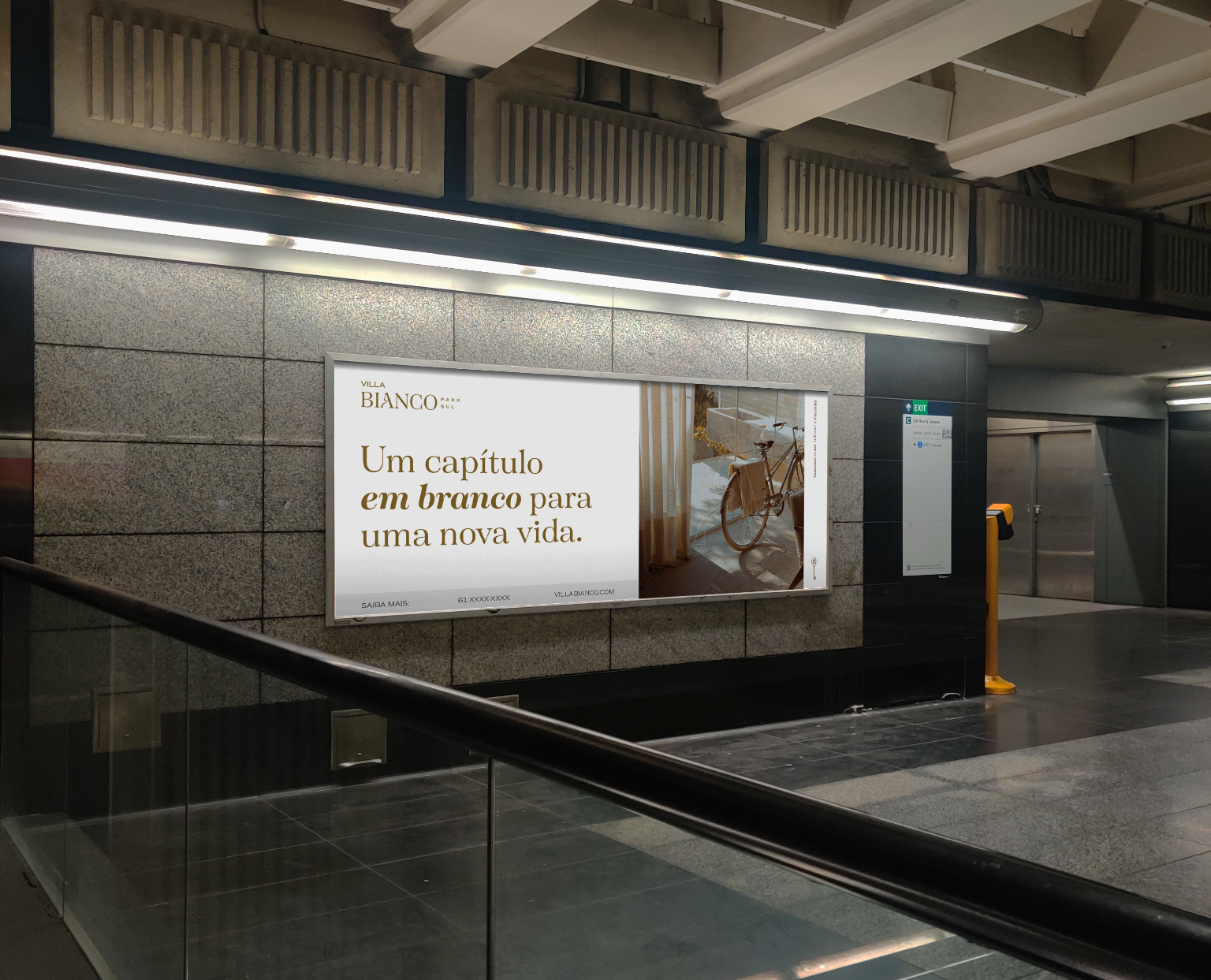
The brand applications translate the visual identity into a broader set of materials, demonstrating how the wordmark, typography, colour palette, and graphic elements work together beyond the initial logo presentation.
This allows the identity to adapt to different applications while retaining a recognisable visual language. The restrained design approach gives the materials a cohesive appearance, reinforcing the balance between sophistication and warmth established at the beginning of the project.
The selected applications show how the visual concept can be carried through different brand touchpoints, extending Villa Bianco’s identity beyond the wordmark into a more complete visual experience.
Explore the live brand → Villa Bianco on Instagram




Comments