Look & Feel
Updated: Oct 14
Project Overview
Look&Feel is a Brazilian marketing and communication agency with over 13 years of experience and more than 500 projects across more than 10 countries. As the agency grew, expanded into new markets, and broadened its offering across branding, technology, AdTech, and performance, its visual identity needed to evolve with the business.
I led the visual rebranding, building on the identity I had originally designed for the agency. The goal was to create a more mature and contemporary visual system while preserving the recognition and personality already associated with the brand.
View the live brand → Look&Feel website. Instagram → Look&Feel on Instagram
Role: Graphic Designer — responsible for the visual rebranding from concept to implementation
Scope: Visual Identity · Art Direction · Typography · Colour System · Graphic Assets · Image Direction · Brand Applications
Tools: Figma · Adobe Illustrator · Adobe Photoshop · Adobe InDesign


The Challenge
Look&Feel was entering a new stage of growth. Its previous identity had been created for a younger, more informal phase of the agency, while the business was becoming more established and its offering increasingly connected creativity, technology, data, and performance.
The challenge was to evolve the visual language without losing the recognition the brand had already built.
The new identity needed to feel more mature, professional, and technologically relevant while remaining creative and approachable. The goal was not to create a different brand, but to make the existing one feel ready for its next stage.


The Approach
The project began with a collaborative visual exploration developed together with the team.
I created the moodboard with the team, exploring imagery, colour, texture, people, spaces, and
visual references to define the atmosphere the new identity should communicate.
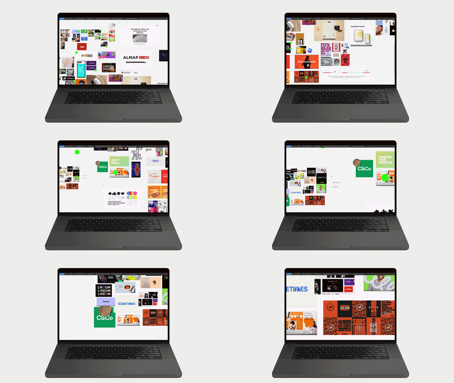
From there, I led the development of the visual system, translating the direction into typography, colour, graphic assets, imagery, and applications.
Because I had also designed the previous identity, the process was not about starting from zero. It was about understanding which elements had accumulated value, identifying what needed to evolve, and creating a stronger visual system around them.

Evolving the Identity
The existing logo was retained because it already carried strong recognition and remained relevant to the brand.
Rather than redesigning the mark, I focused the evolution on the system surrounding it: typography, colour, imagery, graphic elements, and composition.
I also developed a supporting seal based on the Look&Feel name, creating an additional brand asset for applications where a more compact expression was useful. The logo was adapted into horizontal and vertical configurations to improve flexibility and legibility across different formats.

The result is a more structured and contemporary visual language that strengthens the agency's positioning without disconnecting it from its existing identity.


Typography
Roboto became the primary typeface, providing clarity, flexibility, and a contemporary foundation for the system. Its open forms and humanist details keep the identity approachable, while its structured geometry supports a more precise and technology-oriented direction.

Playfair Display was introduced as a secondary typeface, used selectively to create contrast and add personality. Its expressive forms bring an editorial layer to the system without compromising clarity.

Together, the typefaces create a balance between structure and expression.

Colour System
Colour became an important tool for connecting the previous identity with the new direction.
Orange had a strong association with Look&Feel and had become part of the agency's internal culture and recognition. Rather than removing this visual equity, I built a more restrained system around it.
A predominantly dark and neutral foundation brings greater maturity and consistency, while orange remains as a distinctive accent.
The result preserves a recognisable element of the brand's history while giving it a more sophisticated visual balance.


Imagery Direction
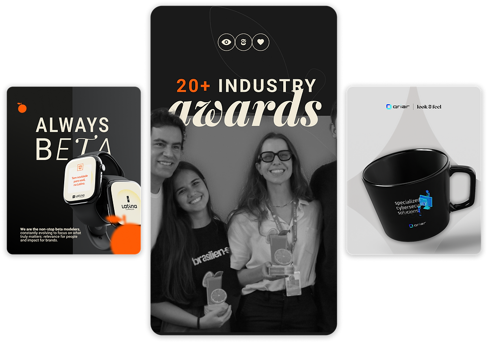
The new imagery direction shifts the focus from technology alone to the people behind the work.
Look&Feel's communication places people and collaboration at the centre of the agency, so photography became an important part of making the identity feel more human.
Two distinct approaches were established: black-and-white imagery for communication where the message takes priority, and colour photography for content focused on people, culture, and the team.
Graphic Assets
I developed a supporting set of graphic elements to extend the identity beyond the logo.
The orange icon became a recurring visual asset, reinforcing the brand's signature colour. The logo could also be used as a graphic element through cropped, transparent, or tonal applications.
A custom icon set was developed around the agency's services, using simple geometric forms with slightly rounded edges to create a contemporary and digital visual language.


Brand Applications
The identity was implemented across the agency's digital and physical touchpoints, including social media, website, presentations, stationery, employee materials, environmental applications, and other brand communications.
The system allows typography, imagery, colour, and graphic elements to be combined according to context while maintaining a consistent visual language.
The current Look&Feel website reflects this system across the brand's digital presence, alongside its current communication on social media.


Comments