Bloomer

01 | Overview
Bloomer is a Mediterranean restaurant and wine bar in Munich, created as a place to slow down, share good food, discover new wines, and stay a little longer.
The concept combines high-quality food and wine with a relaxed, social atmosphere — sophisticated without feeling formal, and creative without trying too hard.
02 | Challenge
Bloomer entered a competitive restaurant scene in central Munich, created by a restaurateur with existing venues in Tel Aviv. Unlike his previous restaurants, Bloomer had its own concept, atmosphere, and visual direction from the start.
The challenge was to create an identity that felt creative, cool, and easy-going while remaining elegant and credible. It needed to attract a young, sophisticated audience without falling into the conventions of fine dining.
The brand also had to feel connected to its name and physical environment. With a changing menu, rotating wine selection, seasonal flowers, and a dynamic social atmosphere, Bloomer was never meant to feel fixed or overly polished.
The identity therefore needed to feel alive, flexible, and slightly unexpected — more like the atmosphere of the restaurant itself than a traditional hospitality brand.

03 | Approach
The visual direction was developed collaboratively with the client through a series of discovery sessions focused on the brand’s personality, audience, atmosphere, and ambitions.
Together, we explored references across color, photography, texture, people, spaces, and visual culture, identifying what felt authentic to Bloomer — and what felt too polished, generic, or disconnected from its personality.

The restaurant’s interior design was also considered throughout the process, ensuring the identity would not exist as a separate layer, but become part of the overall physical experience.
Approach

04| Concept
A brand that blooms
Bloomer is designed to evolve.
Its menu changes. Its wine selection changes. The flowers in the space change. Different people, moments, and combinations constantly shape the atmosphere.
Instead of treating this variability as inconsistency, the identity embraces it as part of the brand.
The logo remains recognizable and consistent, while its symbol can take on different forms inspired by nature, wine, and the idea of blooming. A shared visual structure keeps the system coherent, allowing the identity to change without losing its core.


05 | Logo & Typography
The Bloomer wordmark uses Agilera, chosen for its organic forms, elegant ligatures, and Art Nouveau influences. Its flowing curves create a natural connection to the idea of blooming,
while the contrast between thick and thin strokes brings rhythm and personality to the identity.

The primary symbol was developed from a sketch provided by the client, combining two central elements of the brand: wine and blooming flowers. The form was refined to improve scalability and consistency while preserving the original concept.

For supporting typography, Roboto provides clarity and stability across functional applications. Marlide Display introduces contrast and personality, adding a more expressive layer to headlines and selected brand moments.

06 | Colors
The color palette was designed to move away from the restrained, neutral language often associated with premium hospitality.
A warm, earthy foundation provides balance and visual stability, while richer and more vibrant tones introduce energy, creativity, and personality. Different shades and variations allow the palette to shift across applications without losing cohesion.
The result is a colorful and layered visual language that feels vibrant, welcoming, and expressive rather than polished or minimalist — reflecting the atmosphere Bloomer aims to create.


07 | Brand assets
Supporting graphic assets extend the identity beyond the logo.
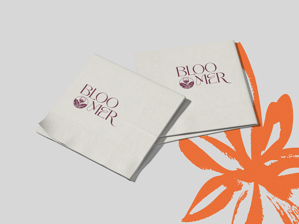
Hand-painted floral illustrations reinforce the organic character of the brand while connecting with the artwork and textures planned for the restaurant interior.

Gastronomy-inspired illustrations add a more playful layer, bringing food and drinks into the visual language without becoming literal.

A series of stamps references the international origins of the wine selection and Bloomer’s connection to different cultures. Their vintage character also creates a subtle visual link to the brand’s sister restaurants, while their modular format allows them to be combined freely across menus, packaging, and other touchpoints.


08 | Brand Applications
The identity was designed as a flexible system rather than a single fixed composition, allowing colors, symbols, illustrations, and stamps to be combined differently across touchpoints while maintaining a recognizable visual language.
The result is a brand that can feel different from one application to another without losing its core identity.




Comments